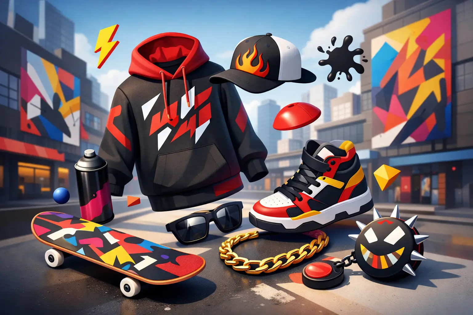
Some fits get worn. Some fits talk back. That’s the line bold graphic streetwear lives on - loud enough to get noticed, sharp enough to say something, and real enough to feel like you meant it.
This isn’t about throwing a giant print on a tee and calling it personality. Anyone can print big. Not everyone can make it hit. The difference comes down to message, placement, color, attitude, and whether the piece feels lived in or forced. When it works, bold graphic streetwear doesn’t just complete an outfit. It becomes the reason the outfit exists.
What bold graphic streetwear actually means
At its best, bold graphic streetwear is visual language. It uses oversized prints, heavy contrast, raw typography, illustrated artwork, symbols, slogans, and unexpected color to turn clothing into identity. It says you’re not dressing to blend in. You’re dressing with intent.
That intent matters. A graphic can be funny, confrontational, political, nostalgic, chaotic, clean, or cold. The point is that it carries energy. Streetwear has always pulled from music, skate culture, graffiti, sports, design, and local scenes. Graphics became part of that because they move fast and hit instantly. Before someone asks what you’re into, your shirt already answered.
But there’s a trade-off. Loud graphics can age badly when they chase a moment too hard. What feels current today can feel corny six months later if it was built on trend panic instead of point of view. Strong graphic streetwear lasts when the visual feels connected to a real voice.
Why bold graphic streetwear keeps winning
People don’t buy statement pieces because they need another shirt. They buy them because neutral basics can only say so much. A clean blank tee has its place, but it doesn’t always carry mood, opinion, or edge. Bold graphics do.
That’s a big reason the style keeps holding ground even as trends swing between minimal and loud. There will always be a lane for stripped-back looks. There will also always be people who want their clothes to do more than look expensive and quiet. Streetwear came up through scenes that valued signal. Your jacket, your print, your logo, your patchwork, your references - all of it told people where you stood.
That hasn’t changed. If anything, it matters more now because the market is flooded with safe product. So much fashion looks optimized to offend nobody. Bold graphic streetwear cuts through that. It feels riskier. More personal. Less algorithm-made.
The difference between bold and trying too hard
Not every loud piece is good. Size alone doesn’t create impact. The best graphics have tension. Maybe the artwork is oversized but the palette stays controlled. Maybe the message is blunt but the garment shape keeps it grounded. Maybe the front is clean and the back goes crazy. Balance is what keeps a piece from looking like merch for a fake event.
Typography is a good example. Big text can go hard if the words carry weight and the type treatment matches the mood. If the phrase is weak, no distressed font in the world is saving it. Same with imagery. A graphic can be chaotic and still feel intentional, or detailed and still feel flat. It depends on composition.
That’s why people who really know streetwear look past the first reaction. The question isn’t just whether the piece is loud. The question is whether it has presence. Presence lasts longer than shock.
How to wear bold graphic streetwear without losing the fit
A strong graphic piece should lead, not compete with everything else you’ve got on. If the tee or hoodie is carrying the message, let the rest of the outfit build the frame around it. That usually means cleaner pants, stronger proportions, and shoes that support the mood instead of fighting for their own spotlight.
If the graphic is packed with color, the easiest move is to pull one tone from the print and echo it somewhere else. That keeps the fit locked in without looking overstyled. If the piece is black, white, and high contrast, you’ve got more room to play with shape and texture. Baggy cargos, washed denim, mesh shorts, work pants, and layered outerwear all change how the same graphic lands.
There’s also the question of scale. Oversized graphics usually work best with relaxed silhouettes because the visual weight matches the cut. A huge back print on a slim, stiff tee can feel off. On a boxy shirt with some room, it feels right. Streetwear is never just the artwork. It’s the garment, the proportion, and the way it moves.
Bold graphics on tees, hoodies, and beyond
Tees are the obvious home for graphics because they give you a flat canvas and easy visibility. But hoodies may be where the style gets its strongest impact. A heavyweight hoodie with a clean front and a hard back graphic has a different kind of authority. It feels more built, more complete, more like a centerpiece.
Outerwear changes the game too. Graphics on jackets, varsity pieces, and overshirts carry more commitment. They’re not as casual as a printed tee, which is exactly why they hit. The trade-off is versatility. A loud graphic jacket won’t rotate as easily as a solid one. But when you wear it right, nobody cares that it’s not the practical option.
Then there’s placement. Front graphics are direct. Back graphics feel more cinematic. Sleeve prints can add motion. Small chest hits with massive back art create tension. Full-print pieces can work, but they demand discipline everywhere else. Once every inch is talking, the fit can lose clarity fast.
What makes a graphic feel authentic
Authenticity gets thrown around a lot, but people can spot the fake version quickly. In streetwear, authentic usually means the design feels rooted in something. A real perspective. A real scene. A real obsession. It doesn’t have to be serious, but it does have to feel owned.
That’s why the best brands don’t just decorate garments. They build a visual vocabulary. You start recognizing how they use type, how they frame ideas, what references they pull from, how aggressive or restrained they are. The pieces feel related without feeling repetitive.
When a brand misses that, the result is random. One tee looks punk. The next looks luxury. The next looks anime. The next looks like corporate irony. There’s no center. Bold graphic streetwear can borrow from anywhere, but it still needs a point of view holding it together.
For a brand built around self-expression, that part matters even more. Fresh Po'Boy gets that the clothing has to say something before the customer ever does. If the graphic doesn’t carry voice, it’s just decoration.
Trends move fast. Identity moves better.
Streetwear always has trend cycles. One year it’s all maximalist prints and chrome type. Then it swings toward faded colors, cracked ink, and vintage sports references. Then everybody wants clean, tiny branding again. The cycle never stops.
That doesn’t mean you should ignore trends. It means you should know the difference between a useful influence and a costume. Trends can sharpen your eye, but identity should make the final call. If a graphic piece looks current but doesn’t feel like you, it usually dies in the closet after two wears.
The better move is picking pieces that still feel sharp when the timeline moves on. Strong artwork. Good blanks. Smart placement. A message you won’t cringe at later. That’s how bold stays wearable.
The real power of bold graphic streetwear
The best thing about this style isn’t that it grabs attention. Plenty of bad clothes do that. The real power is that it lets you be specific. It gives shape to your taste. It lets attitude show up before you say a word.
That matters in a space where so much fashion has gone safe, clean, and forgettable. Bold graphics push back on that. They give people something to react to. Sometimes that reaction is love. Sometimes it’s confusion. Either way, at least the fit had a pulse.
And that’s the whole point. Wear the piece that says what the plain one never could. Let the graphic carry heat, not just ink. If it feels honest, it won’t need explaining.