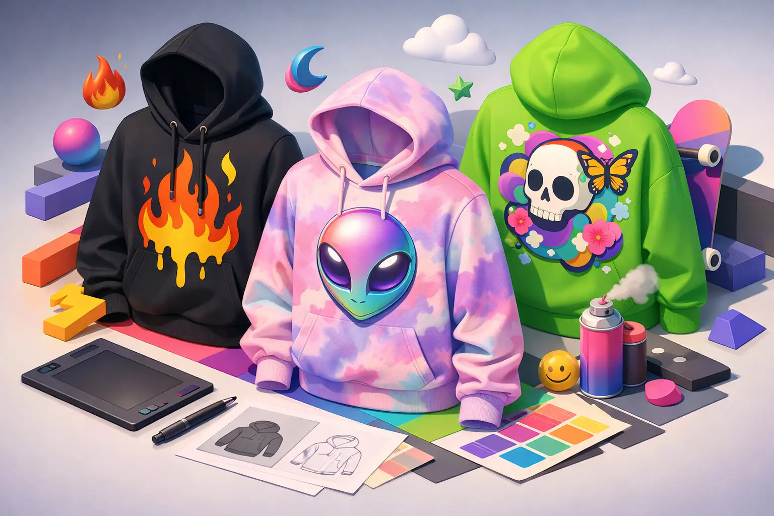
A hoodie can still be just a hoodie. But that is not what people are reaching for right now. The best graphic hoodie design trends are built around presence - pieces that speak before you do, without looking like they tried too hard.
That shift matters because streetwear is not chasing clean basics the way it did a few seasons ago. People still want versatility, but they also want point of view. A graphic hoodie now has to hit on sight, hold up in a fit pic, and still feel real when worn three times a week. If the design looks empty, overworked, or trend-chasing, people clock it fast.
Why graphic hoodie design trends feel louder now
Streetwear has always moved through cycles of restraint and excess. Right now, the energy leans expressive. Not messy for the sake of noise, but more willing to take up space. Bigger statements. More intentional tension. Less fear of being seen.
Part of that comes from how people wear hoodies today. They are not just layering pieces under jackets anymore. They are often the whole message. If the hoodie is the centerpiece, the graphic cannot feel like an afterthought tucked onto the chest. It has to carry identity.
That is why the strongest designs are doing more than adding artwork to fleece. They are building a mood. Some feel aggressive. Some feel ironic. Some lean cryptic. The common thread is clarity. Even when the design is abstract, the attitude reads instantly.
The graphic hoodie design trends leading the look
Oversized back graphics still run the lane
Big back prints are not new, but they are still one of the clearest signals in current streetwear. The difference now is how they are being handled. The lazy version is one huge image with no structure. The better version uses scale with control.
Designers are balancing a dominant back graphic with a smaller hit on the front, sleeve, or hood. That creates a full piece instead of one loud panel and a blank body. It also makes the hoodie read from every angle, which matters when style lives on camera as much as in real life.
The trade-off is obvious. Go too big and the graphic can wear the person instead of the other way around. A giant print only works when the artwork has shape, breathing room, and enough contrast to stay readable on fabric.
Typography is getting sharper, not safer
Text-based hoodies are still strong, but basic slogan placement is not enough anymore. What feels current is type with tension. Distressed serif fonts next to modern sans. Condensed all-caps stacked tight. Curved text that frames imagery instead of floating above it.
Words matter, but treatment matters more. A weak phrase can survive if the design language is hard. A strong phrase can still fall flat if it looks like default software text dropped on cotton.
This is where brand voice really shows. Streetwear buyers can spot fake attitude fast. If the wording sounds forced, corny, or too polished, the whole piece loses credibility. The text has to feel lived in, not focus-grouped.
Mixed visual references are everywhere
One of the clearest graphic hoodie design trends is collision. Vintage sports cues with punk type. Anime-inspired illustration with luxury-style layout. Spiritual symbols next to industrial graphics. Airbrush energy mixed with clean editorial spacing.
That mashup works because younger shoppers do not sort culture into neat categories. They pull from music, internet history, skate, gaming, tattoos, racing, and archive fashion all at once. The hoodie becomes a collage of signals.
Still, there is a line between layered and random. Good collision creates friction with purpose. Bad collision looks like a mood board that never became a design. If every reference is screaming, none of them land.
Placement is getting less predictable
The front-center print is never going away, but it is no longer the default move for every strong piece. More brands are pushing graphics off-center, wrapping them around seams, dropping small hits near the hem, or extending art onto sleeves and hoods.
That makes the hoodie feel designed instead of printed. It gives the garment more movement. It also creates little reveal moments, which matter when people want clothes that hold attention beyond the first glance.
But placement experiments only work if the garment is built for them. On a cheap blank, unusual placement can look accidental. On a well-cut hoodie with enough weight and structure, the same move feels intentional.
What colors and finishes are actually hitting
Color stories are getting more selective. That does not mean boring. It means the best hoodies usually choose one lane and stay in it.
Faded black, washed charcoal, mud brown, bone, forest green, and vintage navy are all landing because they give graphics texture before the print even starts. They feel worn-in, which adds depth to both loud and minimal artwork. Bright colors still have a place, especially acid tones or sharp reds, but they work best when the rest of the design is disciplined.
Ink finish matters too. Puff print, crackle effects, distressed overlays, and soft-hand ink are all part of the current mix because people want graphics with character. A flat, plastic-looking print can kill a good concept. Texture makes the art feel embedded into the hoodie instead of pasted onto it.
This is one of those places where trend and quality cross paths. Special print effects look great when done right. Done badly, they age fast, peel weird, or feel gimmicky.
The return of artwork with actual emotion
For a while, too many graphics were running on recycled irony. Clever enough to get a reaction, not strong enough to mean much. That is changing.
People still like humor, but they also want graphics that feel emotionally charged. That can mean darker illustration, spiritual undertones, apocalyptic imagery, hand-drawn marks, memory-heavy photography, or phrases that sound personal instead of performative. The point is not to be dramatic for no reason. The point is to feel like there is something behind the design.
That is why artwork with rough edges is having a moment. Imperfection reads as human. A line that looks hand-drawn can hit harder than something overly clean because it carries presence. In a market crowded with polished sameness, emotion stands out.
Minimal graphics are not dead, but the bar is higher
There is still room for restraint. A small chest hit, a tonal print, or a near-hidden detail can look strong when the garment itself has shape and the design has intent. Minimal does not mean weak. It means precise.
The problem is that too many brands confuse minimal with unfinished. If the hoodie is relying on subtlety, every choice has to be tight - the blank, the wash, the ink tone, the placement, the spacing. Otherwise it just looks empty.
That is the bigger pattern across current design. People are more selective now. They are not buying a graphic just because it exists. It has to feel considered.
What makes a graphic hoodie feel current without feeling disposable
The best trend-aware hoodies do not copy one visual formula. They understand why certain pieces connect. Strong scale. Clear attitude. Good fabric. A graphic that matches the energy of the garment. That balance is what keeps a hoodie wearable after the trend cycle moves.
If you are watching the market, the real lesson is simple. People want statement pieces, but they do not want empty noise. They want clothes with a pulse. Something that feels specific. Something that says more than brand name, more than logo, more than whatever everybody else printed last month.
That is where labels like Fresh Po'Boy have room to stand apart. Not by being louder for no reason, but by making sure the design actually speaks.
The next wave of hoodies will not belong to the safest graphic or the busiest one. It will belong to the piece that feels honest the second you see it - and even better once you put it on.