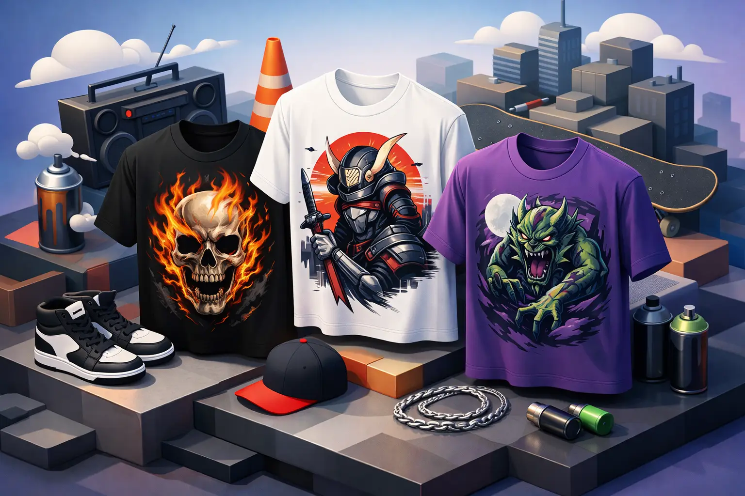
Some shirts just fill space. Others talk before you do. The best graphic streetwear shirts land in that second category - the kind that make a fit feel intentional, not accidental.
That matters because graphic tees are not all built the same. A loud print alone does not make a shirt worth wearing. In streetwear, the best pieces carry energy, fit right, hold up over time, and actually say something. If the shirt looks forced, feels cheap, or copies whatever was trending last month, people can tell.
What makes the best graphic streetwear shirts work
A strong graphic shirt starts with the message. That does not always mean actual text. Sometimes the message is in the artwork, the reference, the color clash, or the way the print sits on the body. The shirt should feel like a choice. Not filler. Not an afterthought.
Fit is the next thing. Streetwear has always played with shape, but that does not mean every oversized tee is automatically hard. Some cuts drape clean. Some just look sloppy. The best graphic streetwear shirts usually have enough structure to hold their shape and enough room to feel relaxed. Boxy fits hit for a reason, but proportion still matters. If the sleeves are too long, the collar is flimsy, or the body twists after one wash, the whole piece loses impact.
Fabric matters more than people admit. A lot of graphic shirts look great online and feel weak in person. Thin cotton can work if the cut is right and the print is sharp, but heavyweight tees usually bring more presence. They sit better, layer better, and age better. That slightly stiffer feel gives the graphic a stronger base.
Then there is the print itself. Good graphics feel placed with intention. Bad ones feel pasted on. You can see the difference fast. A smart front hit, a back graphic with room to breathe, or a wraparound print that actually works with the shirt color will always beat a random oversized image with no point of view.
Best graphic streetwear shirts are about identity, not just design
Streetwear has never only been about clothes. It is about signal. Taste. Community. Attitude. The best graphic streetwear shirts work because they let people show what lane they are in without overexplaining it.
That could mean art-driven graphics, coded references, rebellious slogans, surreal imagery, music influence, skate energy, regional pride, or designs that feel personal instead of mass produced. The key is that the shirt has a voice. It does not need to scream, but it has to say something.
This is where a lot of brands miss. They confuse volume with personality. Bigger print. More colors. More chaos. But graphic streetwear is strongest when the design feels edited. A shirt can be loud and still look refined. It can be simple and still feel dangerous. That balance is where the real heat lives.
If you wear streetwear to stand apart, generic graphics will work against you. The best shirts do not look like trend-chasing inventory made for everybody and nobody at the same time. They feel specific.
The styles worth paying attention to
There is no single formula, which is part of the appeal. But a few graphic shirt styles keep proving themselves.
Typography-heavy tees hit when the words feel sharp, not fake-deep. A clean phrase, an aggressive type treatment, or a slogan with actual edge can carry an entire shirt. The risk is obvious - corny messaging dies fast. If the phrase sounds like something pulled from a mood board instead of real culture, leave it.
Illustration-led shirts bring more personality when the artwork has character. This could lean comic-inspired, punk, distorted, graffiti-coded, or abstract. These shirts work best when the art feels original and the print quality can keep up. Muddy lines and washed-out colors kill the whole point.
Minimal graphics also deserve respect. Not every statement piece needs a full back print with ten design elements fighting for attention. Sometimes a small chest hit and one strong idea do more. Minimal only works, though, when the fit, fabric, and placement are dialed in. Otherwise it just looks unfinished.
Vintage-washed and faded graphic tees keep showing up for a reason too. They carry that lived-in feel without needing years of wear. Done right, they look seasoned. Done badly, they look fake-aged and overworked. The wash should support the design, not distract from it.
Fit can make or break the shirt
People talk about graphics like the print is everything. It is not. The fit decides whether the shirt looks elevated or thrown on.
Boxy tees tend to win in streetwear because they create shape without trying too hard. They sit wider through the body, usually with a slightly cropped or balanced length, which helps the shirt stack well with cargos, denim, or shorts. That silhouette also gives graphics more room to sit clean.
Oversized fits can be tough too, but only if the proportions are right. Too long and the shirt starts looking lazy. Too wide without structure and it loses form. A good oversized graphic tee should still feel designed.
More standard fits are not off the table either. If your style leans cleaner, a closer fit with a strong print can look just as powerful. It depends on how you build the rest of the outfit. A slimmer shirt under an open layer, with looser pants and the right sneakers, still plays.
The move is knowing your frame and your styling habits. The best graphic streetwear shirts are not just good in theory. They work on body.
How to tell if a graphic shirt is actually worth buying
Start with the blank. If the collar looks weak in product photos, it will not get better in real life. If the cotton looks paper-thin and the drape feels off, you are probably paying for a graphic and not a garment.
Then look at how the design interacts with the shirt color. Strong graphics usually have contrast, but not every shirt needs the same formula. Some of the best pieces use tonal printing, offbeat color combinations, or a faded ink effect that feels more wearable than bright, flat plastisol.
Print method matters too. Soft-hand prints age differently from thick prints that sit heavily on the fabric. Puff print can add texture when used sparingly. Screen printing usually gives the cleanest result for bold graphics. Digital prints can work, but lower-quality ones often look too slick and lifeless for streetwear.
And yes, price matters. Expensive does not always mean better. Some shirts charge premium prices for borrowed aesthetics and average construction. On the other side, the cheapest option often shows its flaws after a few wears. The sweet spot is a shirt that balances concept, quality, and repeat wear. If it only works for one outfit or one season, think twice.
Styling the best graphic streetwear shirts without doing too much
A graphic shirt should lead, not compete with everything else. If the tee is loud, let the rest of the fit support it. Clean cargos, washed denim, work pants, or relaxed shorts usually do the job. Footwear can shift the whole mood - sneakers keep it classic, boots rough it up, and simple low-profile pairs make the shirt feel more intentional.
Layering changes the read too. A graphic tee under an open flannel, lightweight jacket, or zip hoodie gives the print a frame. It can also make a more aggressive design easier to wear day to day. If the shirt already has a full front and back story, though, let it breathe.
Accessories should feel like punctuation, not a speech. Hat, chain, bag, maybe rings. Enough to finish the fit. Not enough to blur it.
Why the shirt still matters in a trend-heavy market
Streetwear moves fast. Too fast sometimes. That is exactly why the graphic shirt still holds weight. It is one of the few pieces that can carry a full point of view without needing a complicated outfit around it.
When a shirt is done right, it becomes more than merch, more than a basic, more than something to throw under a jacket. It becomes part of your language. That is why brands built around self-expression still keep the graphic tee close to the center. Fresh Po'Boy lives in that same lane - streetwear that speaks only works when the shirt actually has something to say.
The real test is simple. Put the shirt on. If it changes your posture a little, if the fit feels sharper, if the graphic feels like you and not just something you bought, that is the one. Go for pieces with presence, not noise. The best graphic streetwear shirts do not beg for attention. They earn it.